The Unserious Reputation of Color
Color has a Bad Reputation
Too cheerful to be serious. Too bright to be credible.
Too popular to be intellectual.
Black and white is the preferred dialect of sophistication.
Because black is deep.White is pure.
Together, they form that chic littlealliance we call “timeless.”
But “timeless” often just means “out of time”
— which, let’s be honest, is usually justcode for out of touch.
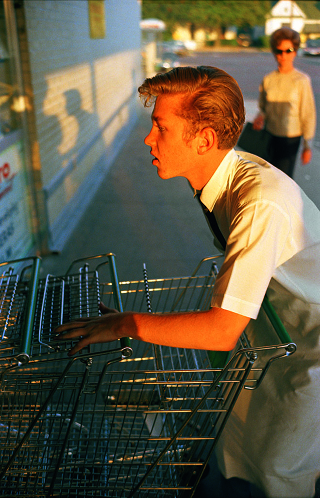
The world doesn’t come in grayscale.It comes in bruises,
in blush, in blood-orange sunsets.
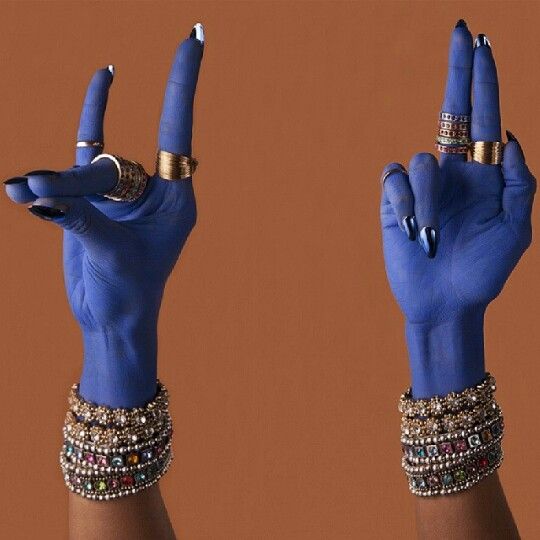
It’s vulgar. Vibrant. Unapologetically tinted.
For Decades, Art Photography treated color like a Second-class Citizen.

Postcards, catalogues, family albums— not museums.
It wasn’t until 1976 that MoMAdared toshow William Eggleston.
The backlash was immediate:“Too banal. Too red. Too real.”
Which is to say: Too alive for the faded versionof reality that passed for artistic.
Fashion followed the same script.
Black and white is the language ofthe fashion intelligentsia— it references Godard without speaking,it evokes Paris without a passport.
It suggests thought, distance, seriousness.
Color, by contrast, screams. It speaks of bodies and skins, sun and want. It smells like lipstick and humidity and a laugh that ends too suddenly. It doesn’t reference — it improvises.
What’s deemed “too colorful” is, most of the time...
Too feminine, too queer, too tropical, too TikTok.
Too too.
As if vibrancy were a crime of excess.
The real excess, perhaps, was believing
that good taste only came in monochrome.
In cities like Paris, nothing feels more rebellious
than wearing a red coat to work. Not because it’s loud
— but because it dares to exist.
The morning commute is a parade of restraint: black, grey, navy, camel.
Color, in the world of work, still reads like a personal opinion.
And opinions are best left unsaid.
We’ve come to equate seriousness with desaturation. Blending in with competence. A silent palette with professional legitimacy.
But this is less about aesthetics than about control.
Color disrupts. It suggests choice, emotion, risk.
And Western workplace codes are built on the illusion of neutrality
— which is, in truth, a policy of erasure.
To look like everyone else is to behave like everyone else.
Uniformity is the price of admission.
Color is still suspect. It insists on being seen.
And that, perhaps, is the real threat
— not that color is unserious, but that it’s too alive to be ignored.
In a world obsessed with discretion, color is a declaration.
It says: I feel something. I see something. I’m not afraid to be seen.
And maybe that’s the real danger.
Not that color is unserious — but that it’s too alive to be controlled.