How to NOT Wear the Pantone Color of the Year 2025!
The Pantone Color of the Year isn’t just a shade
— it’s a statement.
Since 2000, Pantone has made it its mission to crown a “Color of the Year,”
a tradition rooted in the idea that color reflects the cultural zeitgeist.
The original goal was simple: provide a unifying hue to guide designers across industries — fashion, interior design, marketing — you name it.
But what began as a subtle trend suggestion has morphed into a global style directive, influencing everything from the clothes we wear to the latte art in our coffee cups.
In fashion, Pantone’s picks are a mixed bag.
Some years, they translate beautifully on the runway (think Living Coral in 2019 or Very Peri in 2022), while other shades crash harder than a regrettable TikTok trend.
Case in point: 2003’s Aqua Sky, a color that looked great in theory but had everyone wondering why they suddenly felt like a walking pool float.
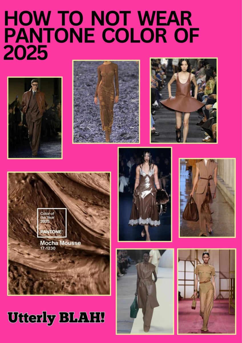
And then there’s 2025’s Mocha Mousse.
Let’s just say… it’s not for everyone.
The rich brown hue might work for home décor or as a background for
a moodboard, but in fashion?
It’s a tough sell. Mocha Mousse swallows the silhouette, erasing anyone who wears it — unless, of course, your skin tone is as pale as fresh snow.
For most of us, it’s a shade best admired from afar, not worn.
After all, not every trend is meant to be worn — and that’s okay.